
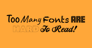
Fonts are to design what spices are to recipes – they are the secret ingredient and vital to make your design successful. Fonts come in all shapes and sizes: modern and straight, arty and fun or curly and individualistic. So, to help you create a successful practitioner’s tool on the Praxel platform, I’d like you to consider a few important and helpful tips. The first reaction is generally picking a font you like, or having a few different fonts on the page, but often that can be detrimental to the piece of information you want to convey.
In a therapy environment with users, readers and clients at different levels, it’s important to consider the following:
Users – Who is reading the information?
Users could be practitioners who are using your therapy tool. These people would probably like to find concise and easy to read information. The wrong font choice can be very distracting in this instance. For example, script fonts in large chunks or curly fonts used as body copy are hard to read. Another group of users might be kids of all ages and with hugely different reading abilities. Some may be adept readers while others may have reading difficulties. You need to consider that the font you choose is appropriate. For example, in speech therapy, cue cards would use fonts that are simple, bold and easy to read. On the other hand, a puzzle (find-a-word) may make reading purposely a little bit harder.
Purpose – Why are they reading it?
The intention of your information is key. The reasons for using/reading your information can vary and range from quickly picking up some instructions, to engaging with the written word on the page (speech tools). Clarity and readability are major key factors when it come to conveying information for anything. In some instances for example when you read instructions – I would say it’s the driving factor. The reader wants to quickly pick up the rules on how to use your therapy tool, so here choosing a simple font that is easy to read is good practice.
![]()
Tone of voice – How are fonts used?
Fonts can have tonality. Across the thousands of fonts available, each of them has a tone-of-voice. It can be friendly, corporate, individualistic or quite bizarre and crass. By choosing a font that has a good user experience, readability and correct tone-of-voice to match your therapy tool/resource, you ensure that your message is not misunderstood.
Trends – How important is trend in regards to your font choices?
There are great resources available to create and design. Apps such as Canva have made designing easier for business owners and people that like to be creative. They provide good insights on how to pair fonts and colours. Designs and fonts like fashion, have trends: at one time or another you may see outlined fonts, or handwritten fonts. You may see bold and blocky or thin and whimsical. It’s great when you can tap into design and apply some trend to your therapy tool. It can raise interest causing people to click on it because it looks nice. However, this can be a double-edge sword as popular trends age or become obsolete just as quickly as they appear. Schedule a font update to your resource for a new, current look when trends change.
Environment – What is it used for?
Depending on the therapy tool itself, this could be an e-book, a speech poster, cue cards, game instructions or digital assets. Consider the best choice for the item you are designing. So for example if you’re designing an item with a lot of text, you may need to consider the size of the copy and font choice for your text carefully. If it’s an item that you want to use to drive engagement or create visual interest you can be more adventurous and perhaps try a type of display front (given your users’ reading ability is not challenged by your choice or it interferes with the success of the teaching tool.
General font families
There are four major categories of fonts:
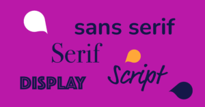
1. Serif (for example, Times New Roman)
- Letters that have short lines coming off the edges.
- Considered formal and traditional and are well suited for print design.
- Improve readability of lengthier amounts of text, delivering a professional and trustworthy impression. Heavily used in book designs due to their effective readability.
2. Sans-serif (for example, Helvetica)
- Used widely across digital and printed mediums.
- Sans-serif fonts make for a clean, intuitive reading experience, particularly in digital form.
3. Script (for example brush script, hand-written, lettering)
- Anything that mimics handwriting is considered a handwritten font. Also known as cursive fonts, they are often used in formal invitations, they are also popular in logo designs or situation where you want you convey personality – evoking a personal and individual touch.
4. Display ( for example, bespoke fonts developed for logos but used beyond the logo)
- These are informal fonts that are entirely original.
- Interpreted as quirky, creative, and fun.
- Highly stylised, usually custom creations.
- Evocative and unique, with extra flair.
A good rule to follow is: less is more. Choosing one or two fonts from one font family for one therapy tool is often enough to bring your tool to live. The internet provides a good range of resources, and we are also able to help you out if you are unsure of how to start.